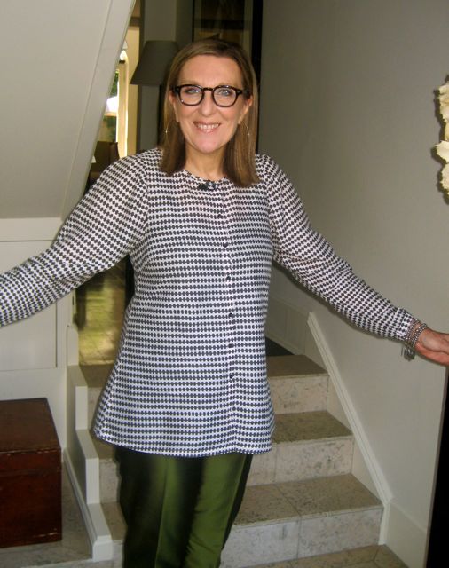
This month’s profile comes from design expert Robyn Holt who is not only a well-respected leader within the industry but is also know for her roles as CEO, Management Consultant, Editor and TV Judge/Mentor on The Renovators. Despite her busy schedule Robyn also finds time to share her inspirations on Instagram which is what prompted me to interview her this month.
About Robyn
Sydney-born Robyn has an extensive international career history spanning publishing, media, fashion, beauty and design. She has held a number of executive positions including CEO of Conde Nast and CEO of design bible Monocle. An active member of several boards, she is the Chairman of Northern Territory Tourism and a councillor for the Australian National Maritime Museum.
1. Which five words best describe you?
Creatively-curious, loyal, energetic, bookish and fun
2. Which two colours are making you happy right now and why?
Each year I look at the Pantone Colour of the Year. I am always curious to see their creative process of choosing that colour. Last year it was ‘emerald’. So many designs embraced that colour and I remember the year before that it was ‘tangerine’. I have to say I didn’t immediately reach out to paint or choose those colours for my interiors but I always see it as an interesting first step. Often a flash of an unexpected bright will rework your décor.
This year’s colour is Radiant Orchid, which is a colour I don’t necessarily warm to but I adore the orchids like phalaenopsis in those wonderful hues. So I looked at how you might use it: bumped up with energetic colours like orange, magenta or chartreuse, or matched with earthy tones of olive or hunter green, and a new way to brighten up greys or whites.
All this has led me to re look at colours similar to lilac like violet, heather and amethyst. And I am happy to be reviewing colours that I once said an immediate “no” to, with the joy of expanding my colour appreciation.
3. What past experience have you had with colour that has influenced who you are today?
I have always been drawn to orange – maybe because I am a child of the 60’s! But I do recall when I went back to Vogue, Nancy Pilcher painted a whole wall in her office orange, as she said the Chinese believe if you look at orange it stimulates the mind. I am not sure about that, but I did spend a long time in her office and I think it did focus the mind!
4. What is your view on how colour impacts your health, mood and wellbeing?
There is no doubt that certain colours have influences on mood and wellbeing.
We all have natural reactions to colour—a clear blue sky can make you feel more peaceful, a bunch of daffodils, more optimistic.
Most of us choose blue as our favourite colour, and it’s really no wonder. Blue is a very soothing hue—it’s the colour of the sky and the sea—and we can all use soothing touches.
I work as a volunteer at one of our leading hospitals and notice that blue dominates most of their colour schemes. Just look at the colours doctors wear in operating theatres. Cool and Calm.
5. How do you use colour in your own home?
I use colour sparingly I adore all the neutrals as it gives me the base palette to add colour, seasonally or ad hoc.
I am constantly using slip covers on sofas and chairs as you can change a room into summer immediately by adding white slip covers, or cozy it up with a rich chocolate for winter. That way you never get sick of your sofa or chairs!
I also like to add cushions or a throw in my favourite seasonal colours for a point of difference.
6. What’s your funniest moment with colour?
I once was asked to help a friend choose a colour for outside his house. I loved deep muddy brown at the time and got the colour charts mixed up. He rang to ask whether I was sure about this colour and I said a confident: “YES”.
But when I went there it was the most hideous bright blue! I was mortified but I paid to have the colour corrected the next day!! Lesson learnt: read the colour numbers and colour swatches carefully!
7. How do you communicate colour in your own work?
At the moment I am designing a lot of websites and I love to play with a background colour that will work with all visuals you lay on top. I love to bleach out colours or add some intensity with secondary or tertiary hues. Colour is fun.
8. What would be your No.1 colour tip for the home?
Before you commit to a paint colour, paint it (two coats) on a large board. Prop or pin it up in the room and look at it in all lights, different times of day and with different pieces of furniture in front of it. Take your time!
You can find more of Robyn’s images and inspirations on instagram at robynh66.
Leave a Reply