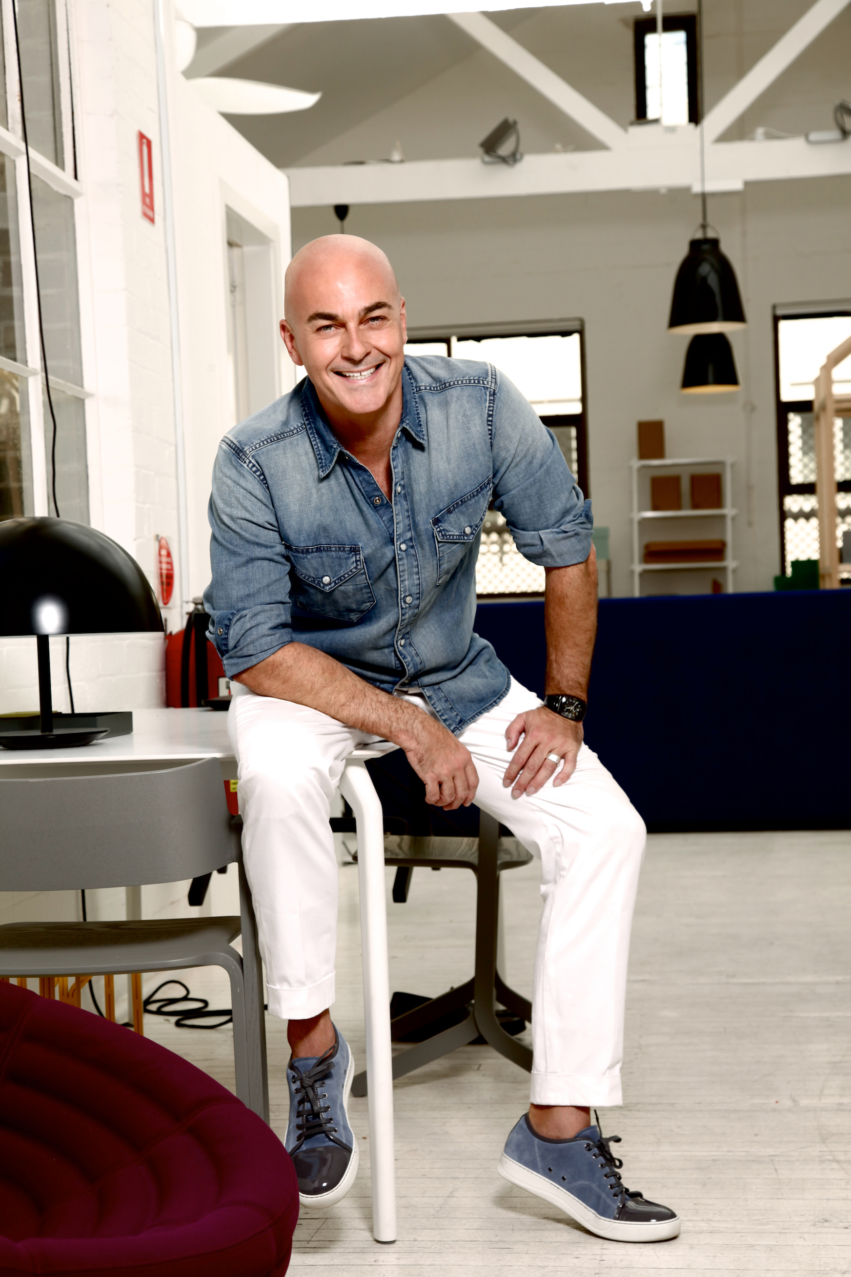
This month’s profile comes from author, editor-in-chief and TV judge Neale Whitaker whose extensive knowledge and experience in the interior design, lifestyle and food industries has earned him respect on both sides of the globe.
About Neale
London-born Neale Whitaker may be best known as the stylish judge on Nine’s Logie-winning smash series ‘The Block’, but he also boasts a hugely successful international publishing career. Formerly the editor of some of the biggest food and style magazines in the world and author of the book The Accidental Foodie, Neale is currently the editor-in-chief of Belle magazine, a design bible for discerning renovators.
1. Which five words best describe you?
Emotional, sentimental, loyal, intuitive, impatient.
2. What colours are making you happy right now and why?
Greens, blues and tones of orange, rust, saffron and terracotta. Why? Because they’re the colours of the bush, the ocean, European landscapes and for me, tranquility.
3. What past experience have you had with colour that has influenced who you are today?
I grew up in England in the ’60s and ’70s in a landscape that was often relentlessly grey. Even the ocean was grey. I used colour as an antidote to that and demanded deep purples and aquas in my teenage bedroom! My first visit to Thailand and Burma in the early 1980s embedded a love of Buddhist colours – the saffrons and rusts that I have just mentioned. To me they are spiritual, calming and meditative.
4. What is your view on how colour impacts your health, mood and wellbeing?
I guess I can only relate colour to health in terms of mental and spiritual wellbeing, but I have no doubt that it contributes positively to both. As the editor of Belle (and as a regular judge on Nine’s The Block), I must see hundreds of rooms each year from around the globe. Colour invariably dictates the emotion – good and bad – those rooms evoke.
5. How do you use colour in your own home?
Colour is used sparingly but effectively at home. I’m lucky that my partner and I love the same colour palette. The backgrounds are whites and neutrals but there are strong hits of orange and green throughout, plus numerous sprays of colour from an extensive art collection that covers most surfaces. I think our house is an exercise in restrained excess! There’s method in the madness.
6. What’s your funniest moment with colour?
Red and purple colour-blocked sweatshirt tucked into pea-green skinny jeans (I was skinnier then too), with white socks and blue shoes. That would have been England, summer 1979.
7. How do you communicate colour in your own work?
I’m not a designer or decorator, so I don’t directly communicate colour. But colour is a constant in my life and throughout the magazine I edit. Colour is celebrated on every page, from the subtlest neutrals (see p128 Feb/Mar Belle) to magnificent bravado displays (see p110 Feb/Mar Belle)
8. What would be your No.1 colour tip?
Introduce colour sparingly if you’re not used to it (through cushions, accessories, art etc) and don’t be influenced by colour trends. If fuchsia is the colour of the moment and you hate it, then don’t go there! Stick with colours you love and those you are naturally drawn to. And don’t impose rules on yourself about what goes with what. Remember they used to say that ‘blue and green should never be seen’ – how ridiculous was that?

[…] this month’s ‘Conversations in Colour‘ we ask Bonnie Ashley from homewares duo Bonnie and Neil for her perspective on all things […]