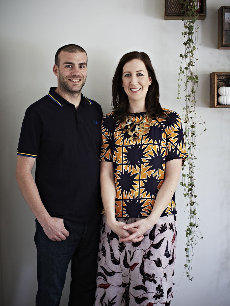
This month we ask Bonnie Ashley from homewares duo Bonnie and Neil for her perspective on all things colour. Bonnie and Neil are known for their vibrant ranges of unique screen printed products for the home. Their approach to design is rather intuitive, involving a combination of traditional printing methods paired with unique applications Bonnie has developed over the years.
About Bonnie and Neil
Founded in 2010, Bonnie and Neil is the vision of real life partners Bonnie Ashley and Neil Downie, who relocated to Australia from New Zealand in 2003 to be among Melbourne’s thriving textile industry. Bringing together their collective backgrounds in floristry, art, textiles, furniture and set design, the pair originally set up a modest pocket-sized studio. Their plan was simple: design an inaugural range and launch it at one of Melbourne’s biggest homewares tradeshows. They have been producing seasonal ranges of cushions, bed linen, napery, and timber and ceramic homewares baring their bold and colourful prints ever since.
1. Which five words best describe you?
Creative, colourful, fun, hardworking and patient
2. Which two colours are making you happy right now and why?
Nectarine Orange and Pink – pink is a staple in my life, although the shades vary from soft to fluoro at times! Right now as the weather is getting colder these shades remind me of warmer climates and put a smile on my face.
3. What past experience have you had with colour that has influenced who you are today?
I’m a trained florist so colour played an important role there in creating beautiful arrangements.
Growing up in New Zealand exposed us to a very multicultural society full of pacific influences, flora and fauna. Neil and I also share a love of travelling so we’re constantly influenced by our surroundings wherever we go.
Our house (and studio!) is full of collectibles from antique furniture to artwork, and glassware to tapestry, these different creative genres all bring a different colourful influence us both professionally and personally.
Australia has a big influence on the way we use colour in our designs. Australians love colour and aren’t afraid to use it, so that’s allowed us to be quite brave in the range of colours that we introduce with each collection.
4. What is your view how colour impacts your health, mood and wellbeing?
Colours definitely play a role here. I like to change rooms at home seasonally to complement the mood. We’ve designed each of our ranges to complement each other so I like to throw a new cushion or two in the mix at home, and always have projects on the go that keep our living space new and fresh.
5. How do you use colour in your own home?
It is ever evolving and changing, normally tonal.
We love having visitors in our home, whether its for a slow leisurely meal, or drinks in our sun filled backyard, we like to make sure each space is inviting. Part of the reason we’ve included tableware and cushions in our range is that we’ve always found a place for them in our home – there’s something lovely about the formality of a nice tablecloth and napkins even for a casual BBQ! And cushions are great for snuggling on the couch or lounging outside on our daybed.
6. What’s your funniest moment with colour?
So as I mentioned I have a love affair with pink, despite the fact that our brand is Bonnie AND Neil, I seem to always get my way with permeating pink through every collection we produce. At final approvals for our new logo design earlier this year Neil didn’t even flinch at the colour (pink, of course).
My favourite ‘Neil and pink’ moment is always when new visitors to our home comment on the pink front door of our house – he’s always very quick to correct them “it’s raspberry”.
7. How do you communicate colour in your own work?
Seasonally and multi-layered. Every collection builds on the last, it’s like telling a story with a hidden meaning.
8. What would be your No.1 colour tip for the home?
Be bold and brave – don’t be afraid to put contrasting colours together. I don’t believe in sayings like “blue and green should never be seen” or “don’t combine clashing patterns”. If you like it, give it a go!

Leave a Reply